From workshopping and mentoring with Annie Atkins, to a portfolio incorporating vintage packaging & branding, vintage style illustration, document forgery, ink work, sculpting, newsprint, copy writing and a good bit of fake blood.
Props for Filmmaking
“And Then There Were None”
A collection resulting from the Annie Atkins workshop in Dublin “Graphic Design for Film”, showcasing five pieces for a hypothetical adaptation of Agatha Christie’s novel. Annie has generously reviewed this portfolio as “…a really, really excellent collection. Great attention to detail in the typesetting, very artistic yet not overly designed choice of colour palette, really great use of analog materials and tricks, excellent copywriting, fun with blood (not everybody goes there), and of course … gorgeous period illustrations (not easy).”
Prop title
And Then There Were None, all
Year
Sept 2025

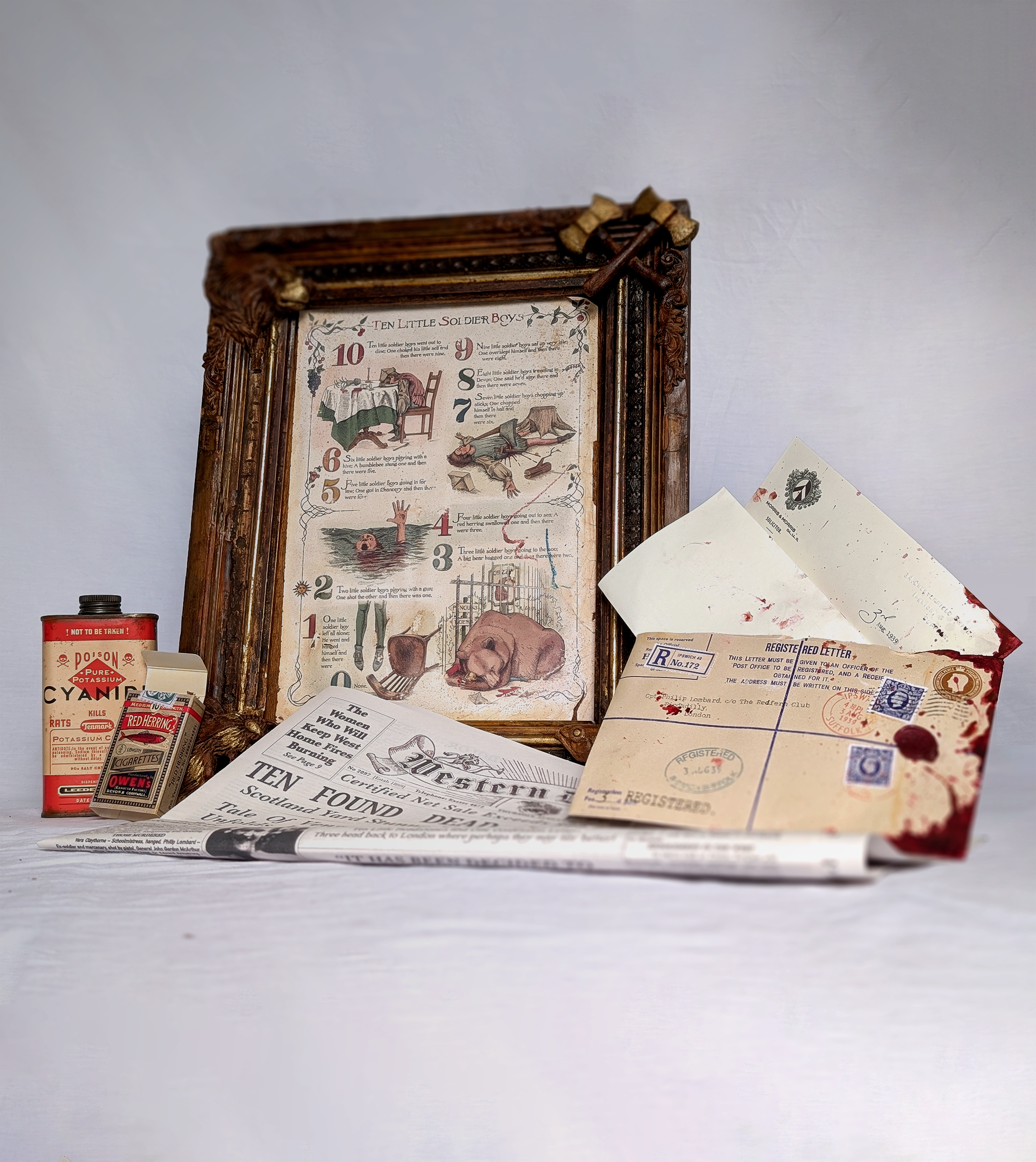
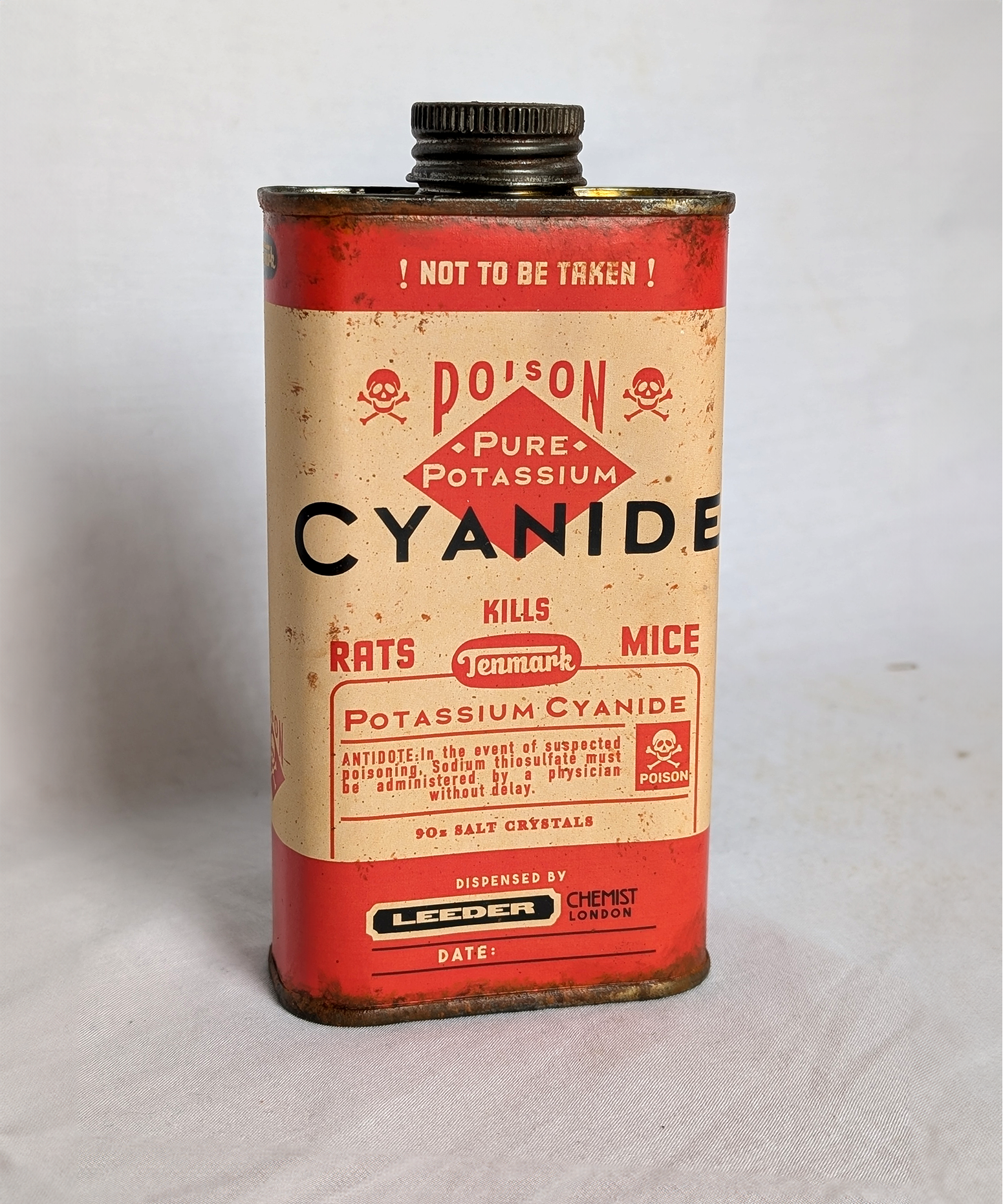
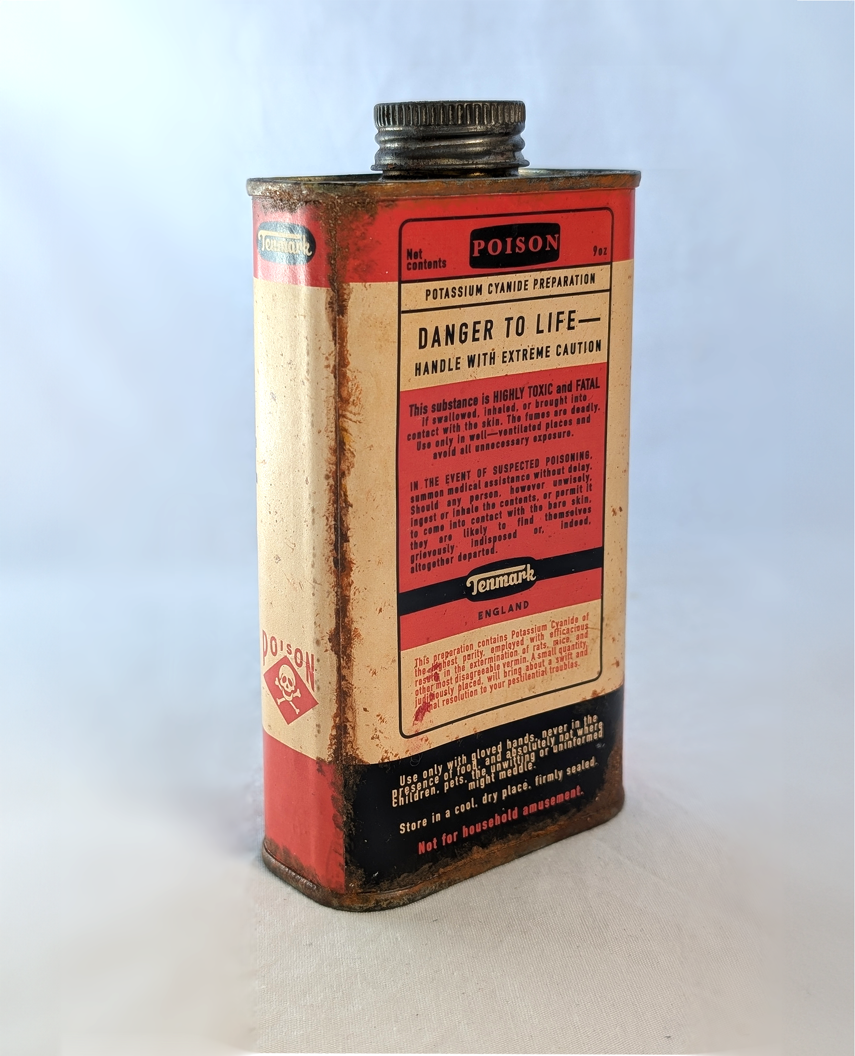
Cyanide
Any murder story is best told with the weapon! For this I used an old tin of Danish oil which matched the shape of vintage rat poison tins. The design itself was based on many tin references of not only rat poison but 1930s medicines, cleaning products and pesticides. Paint mixed with cinnamon dabbed and flicked on with a paintbrush created the rust affect along the label seam. The label itself was printed on 120gsm coated paper used for flyers and glued with wallpaper paste. The label was yellowed with tea and tumeric to take down pink tones
The brand "Tenmark" is a reference to the ten people marked out for slaughter by the judge.
Prop name
Cyanide tin, And Then There Were None
Year
July 2025


Cigarettes
The name “Red Herrings” was chosen as a reference to the poem which is a central theme in Christie’s novel. The design was a combination of online and genuine 1930s cigarette packets so that dimensions, box templates and paper weight could be mimicked exactly. The vintage halftone pattern was discovered from an original box as was the internal tray shape.
The 300gsm coated paper box was manually cut with a stanley knife, folded with a scoring board, and cigarettes were made for fun using autumn leaves as filling. The box was stained a little with tea to take out any stark white edges and interiors.
The tax stamp was hand drawn and scanned for the most authentic feel and cut using a needle and stanley knife, then sprayed lightly with lacquer for a satin sheen.
The company "Owen's" is a reference to the name signed at the end of all the letters in the novel.
Prop Name
”Red Herrings” And Then There Were None
Year
May 2025


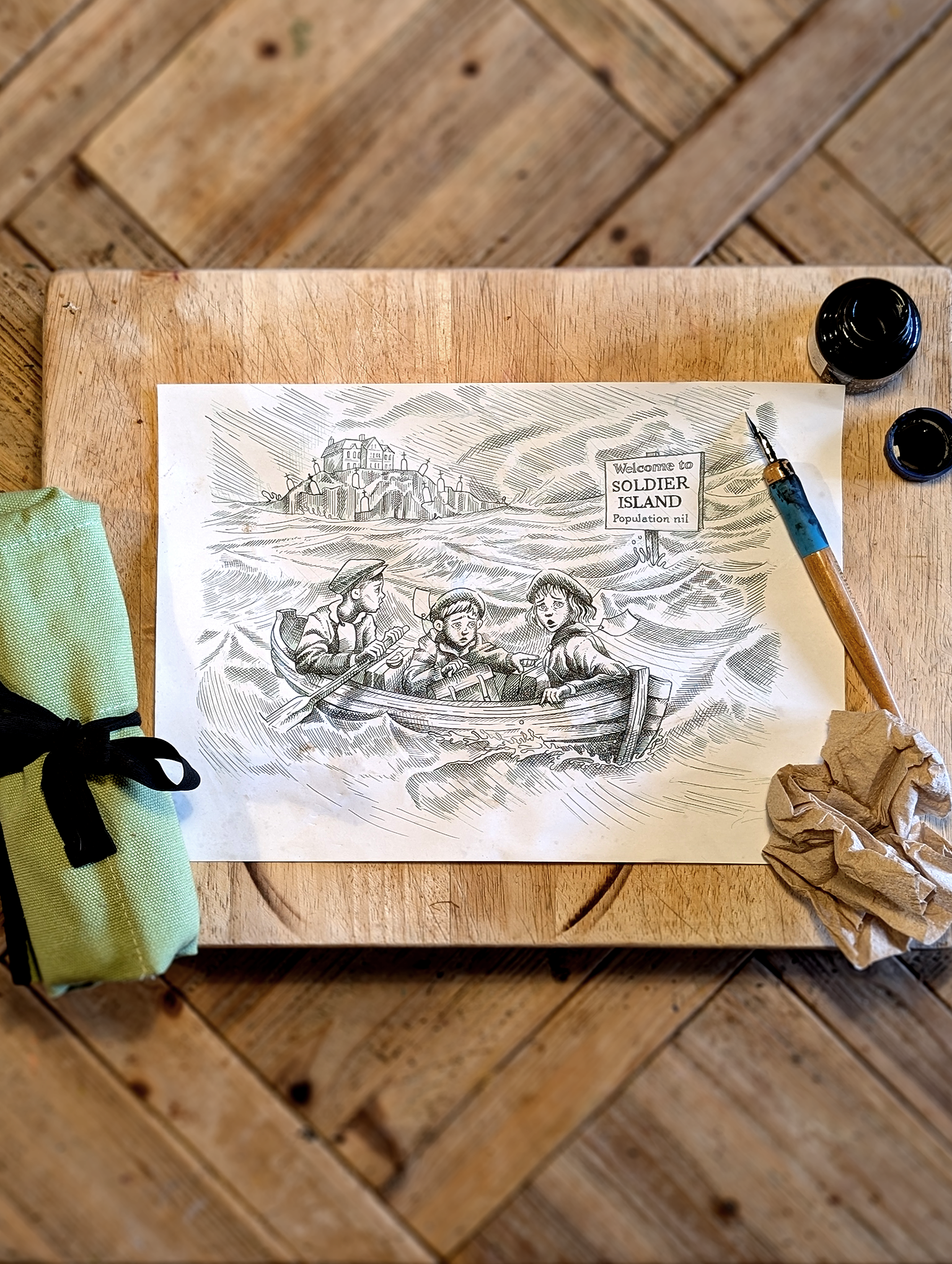
Illustrated Poem and Frame
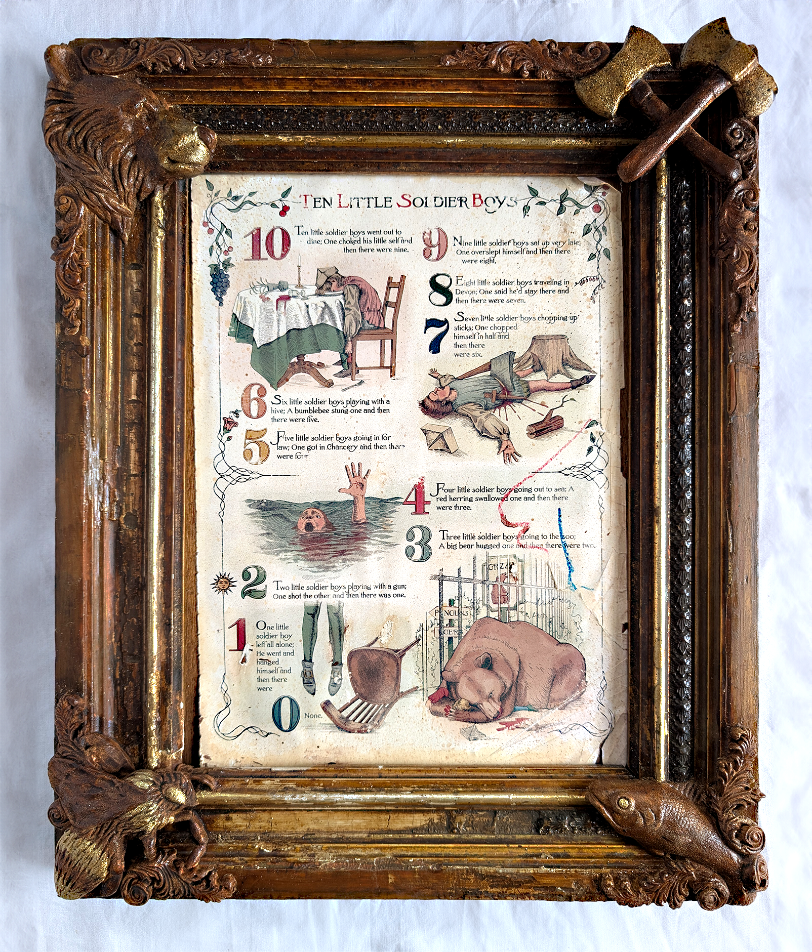
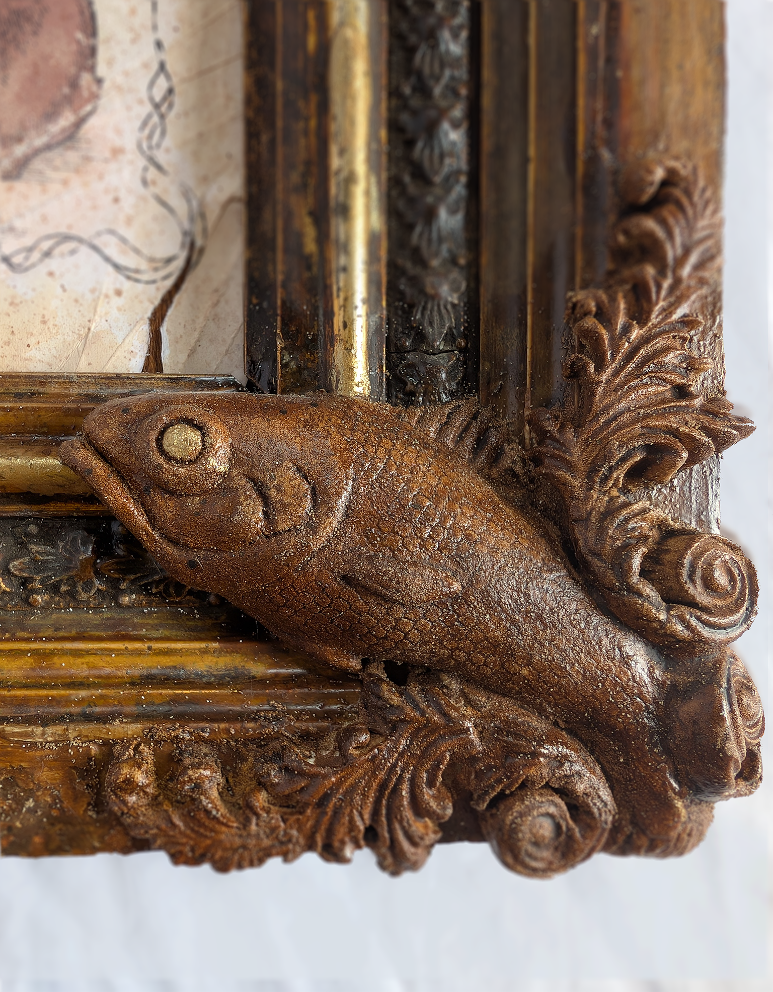
Considering that this poem marks a central plot line to Christie’s novel, dramatic framing was deemed necessary! So a battered frame from an antique shop was sourced with a view to embellish it with details from the poem. This was done by hand modelling paper clay. The fish scales were created with my daughter’s tutu! Having painted it with a mix of paint and wood stain to match the frame, it was sprayed with lacquer.
The poem itself was illustrated with ink and tidied digitally using Mother Goose type references, for the ultimate incongruity of the gruesome meets nostalgia, and the font was a complete font set created from scratch based on Victorian nursery rhymes. Although this novel is set in the 1930s, I felt the poem should feel ancient even for the characters, and appear to be ripped out of a nursery rhyme book, hence crayon marks, stitch seam marks and page deterioration in the corners, also aged with tea spatters.
Prop name
”Ten Little Soldier Boys” poem, And Then There Were None
Year
July/August 2025


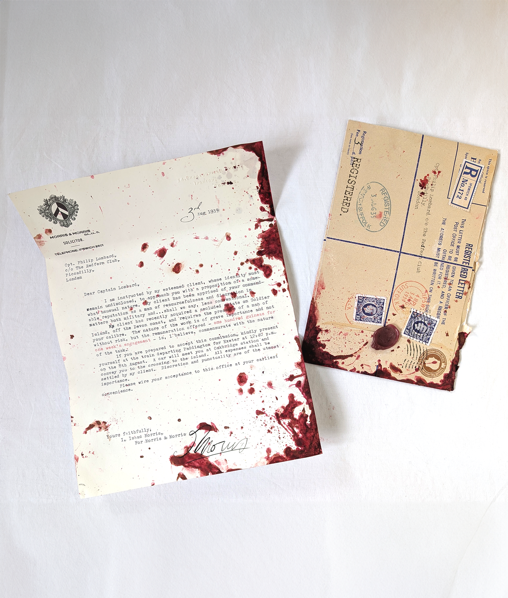
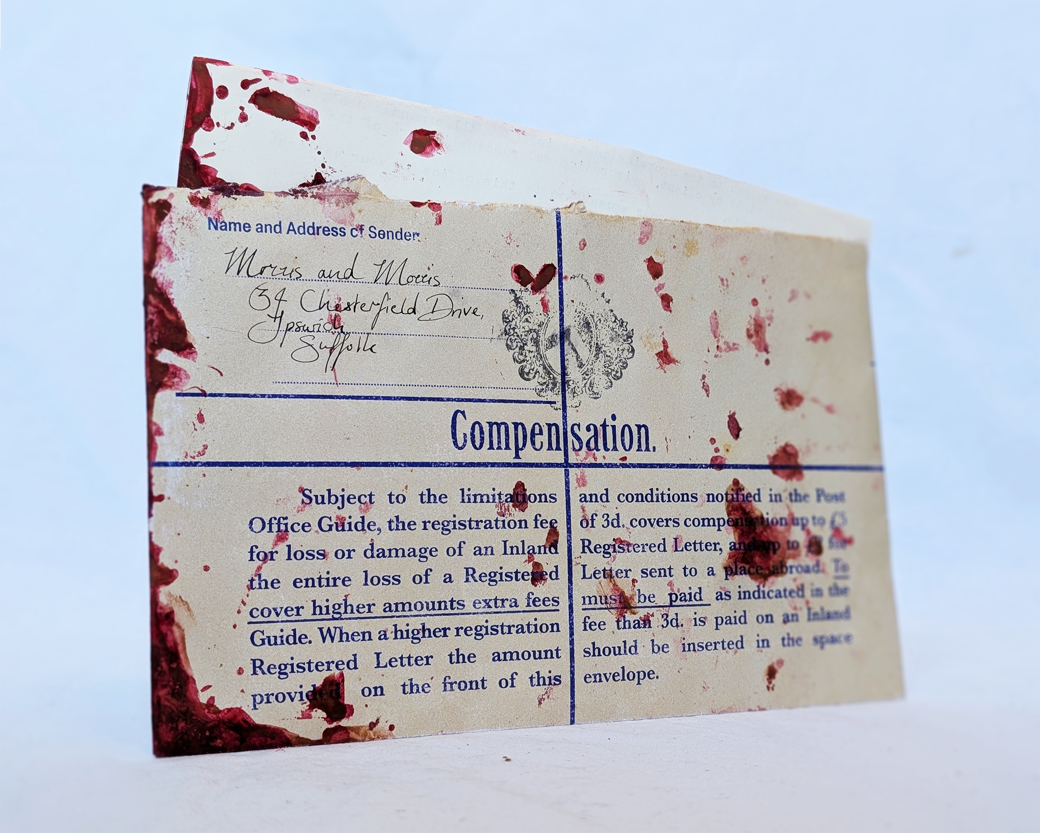
Letter and envelope
For this letter I used a genuine typewriter, a genuine antique embosser and used quarto sized paper of a low gsm which would have been standard for the period. The logo for the solicitor was recreated based on an ink stamp found in an antique shop. The real version of the ink stamp is on the back of the envelope, which is a replicated H size UK registered envelope based on an original I acquired. I did this by font and colour matching and recreating postage stamps from scratch. The Post Office ink cancellation and date stamps were made by transferring ink from my inkjet printer using non-absorbent materials in the printer.
The person carrying this letter is later shot and so blood was a fun addition. A mixture of syrup, food colouring and cocoa powder and was a real challenge to get right.
Prop name
Letter to Lombard, And Then There Were None
Year
June 2025


Newspaper
A genuine 1930s newspaper was acquired as a size and texture reference, and for the layout itself, The 1930s News Of The World newspapers images online (previously a broadsheet) proved particularly inspirational due to the illustrated masthead and comic cartoons on the front page, which I designed and created in ink.
This newspaper is full of personal references. The photo is of my great aunt, the house in the map is a place I was staying at when I drew the map. The map is of Burgh Island in Devon (Christie's inspiration) but the place names are after a friend who recently passed. The advert at the top is for Red Herring cigarettes as a little crossover.
The rest of the 16 page paper is one identical page of columned Lorem Ipsum so that the ink can be seen at the edges and through the paper.
Prop name
Western Daily Herald, And Then There Were none
Year
Sept 2025